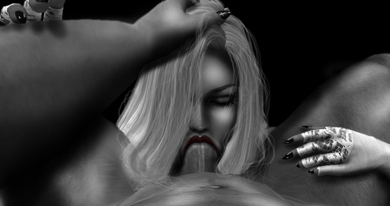
The first installment of this -I hope- series of posts has been one of the most ingenious and versatile personalities of the porn scene, fellow blogger Erika Thorkveld, a nominee this year in the Sexiest®
Awards as a model but also quite crafty with a camera and with a keyboard. With her, it's as if posts write themselves. Or something to that extent.
Now, for this second feature...

...I sat down with yet another Sexiest® Awards nominee, and in three categories at that!
You are most likely already familiar with his work, but as you can see from the photographer feature post brought by Domino, or simply browsing his flickr, you can see how he always brought a lot of inventive solutions to his photos, SL-based but with that 'extra' added that you can't recreate strictly in-world.
Since I am weird, I chose to ask him a couple questions about his work on a set that is probably the most minimalistic he has done in his photography career, but it's one I am quite enamoured with. And doing something so simple so perfectly is a skill of its own. I am talking, as the pictures show, of his 'Ego' set.
How did the inspiration for this set come about?
Like all of my ideas they come to my head spontaneously...as soon as I had the idea i thought: "Let's make it on a black background to keep the attention on the happening....and since nothing than B&W looks better on black background I went for that.
Was it always supposed to be a whole set?
It was ment to be a set from the beginning....There meant to be more to this set but then i went for this amount to keep it not overwhelming. The title "Ego" came just as simple as the idea of the set itself...It's logical, simple and marking the spot.
Definitely it is!
What exactly did you do to set up the in-world part of the photoshoot? Well clearly its to see that all i needed was a black wall wich made it simple. And 2 stands of my Anypose are summing it up on what i needed for it.
And thank you for providing the raw snapshots, I really like to show the 'before' and 'after' of it.
Which photo or photos in the set presented the toughest challenge from a technical standpoint, and which one/ones are your personal favourite, if any?
The most challenging part was keeping the angle the way it is...It can be seen that I didn't completely keep the right spot of the camera. I excuse it with the movement of my head that changes the look :P
Makes sense certainly sense, I doubt many people in your position would be able to keep steady!
I love all of those pictures....some were more challenging according to their posing mostly. But if I had to pick my fvorite i guess it's the one all prefer...the closeup of the deepthroating.
(Ah, you mean the one pic I opened the post with? Ok, got me, it's my fave too.)
Simply it is impacting. Impacting is also the reason why i chose to make it B&W. This way the shading has a way deeper effect, wich was only made with a black and white airbrush, also the additional hair....as most of my work is mainly made with simply a fuzzy circled airbrush. I mostly only rely on my ability to draw with my mouse and a secure hand.
Thank you very much for putting in...
....your opinion.
And thank you everyone for reading: Please, if you did a photo, a set, a comic, a movie, and you are comfortable with the idea of sharing a bit of how you put it together, I'd love to hear it!
The whole set is avalaible for your viewing pleasure on flickr!


No comments:
Post a Comment